

 Did you know that roughly 2/3 of consumers will decide not to buy a product simply because they don’t like its color?
What about the fact that color can increase brand recognition by an astounding 80%?
Finally, over 90% of consumers say that color is the single most important factor in not only their buying decision, but whether or not they decide to interact with your website or products at all.
The takeaway here?
When you’re designing your Divi website, color should be the first thing you think about.
In this post, we’ll tell you how to choose the most effective color scheme for your Divi website.
You need to decide on colors that complement your branding and connect with your target market. Colors can also help to turn casual site visitors into loyal customers and readers.
Read on to learn how to make it happen.
What Is A Divi Website?
Before we get into any discussions of color psychology, let’s make sure you understand what a Divi website is.
Also, let’s look at why the Divi builder program has recently become so popular.
Essentially, Divi Builder is a WordPress plugin that works within any WordPress theme. Its drag-and-drop design means that you can improve the overall look of your WordPress site.
You can do this without having to choose a new theme.
Using these builders to make a Divi website means that you’ll have access to over 40 different ways to adjust and shift your blocks of content.
You can do all this within your preferred theme.
You can add videos, create contact forms, and even build online shops. Instead of spending hours streamlining every internal page of your Divi website, you can just hit “duplicate.”
This way, your adjustments will be saved across your entire site.
This means that you can make your website more intuitive than ever. You can also customize your overall design to perfectly fit with your branding — no compromises necessary.
Best of all?
It’s easy-to-use, meaning you don’t have to be a coding professional to figure it out.
Of course, thanks to the limitless possibilities provided by a Divi website, the colors you choose are more important than ever. Whether you choose to switch up your color themes across individual pages, or want to use the same scheme across your site, you need to choose wisely.
Now, let’s take a look at how color influences your Divi website visitors.
First, Start With Your Branding
Yes, the colors you choose to include on your website will certainly psychology influence your site’s visitors.
But before you start using any mind tricks to boost your conversions?
You first need to think about the colors that best compliment your overall branding strategy and business.
For example, it wouldn’t make much sense to use a bright pinks and purples on a website advertising funeral services.
But sometimes, your color scheme choices as they relate to your branding aren’t quite so obvious.
Remember that people likely come to your website in the first place because they already connect with the ideas of your branding. They are interested in learning more about your products, services, or general content.
This means that, when you’re selecting your color scheme, you need to think about your ideal client. Think about them just as much as you consider colors commonly associated with your industry.
For example, let’s say you’re a skincare website, selling natural masks, cleansers, and creams.
Your target market would likely be women between the ages of 18 and 85, who are wary of the chemicals and harsh ingredients contained in traditional cosmetics and skincare.
Which colors play to a feminine market, but also reflect the natural elements that make your brand a part of a niche market?
Likely, shades like pastel pinks, light greens, and deep blues will resonate with your market while clearly reinforcing the overall message of your brand.
When you’re deciding on a color scheme for your Divi website, start by jotting down a few of the most common words you associate with your brand. In this example, that might be things like “cruelty-free,” “organic,” or “clean.”
Then, think about which colors echo those words and ideas. Use them to inform your color scheme choices.
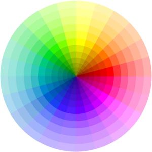
The Psychology of Color
Of course, branding is part of a larger strategy to make your customers convert. This means that ultimately, you want your branding to encourage your website visitors to take a specific action on your site.
Maybe you want them to sign up for an e-newsletter. Perhaps your goal is to have them complete a purchase.
Whatever you’re aiming for, you can use the psychology of color to help you make it happen.
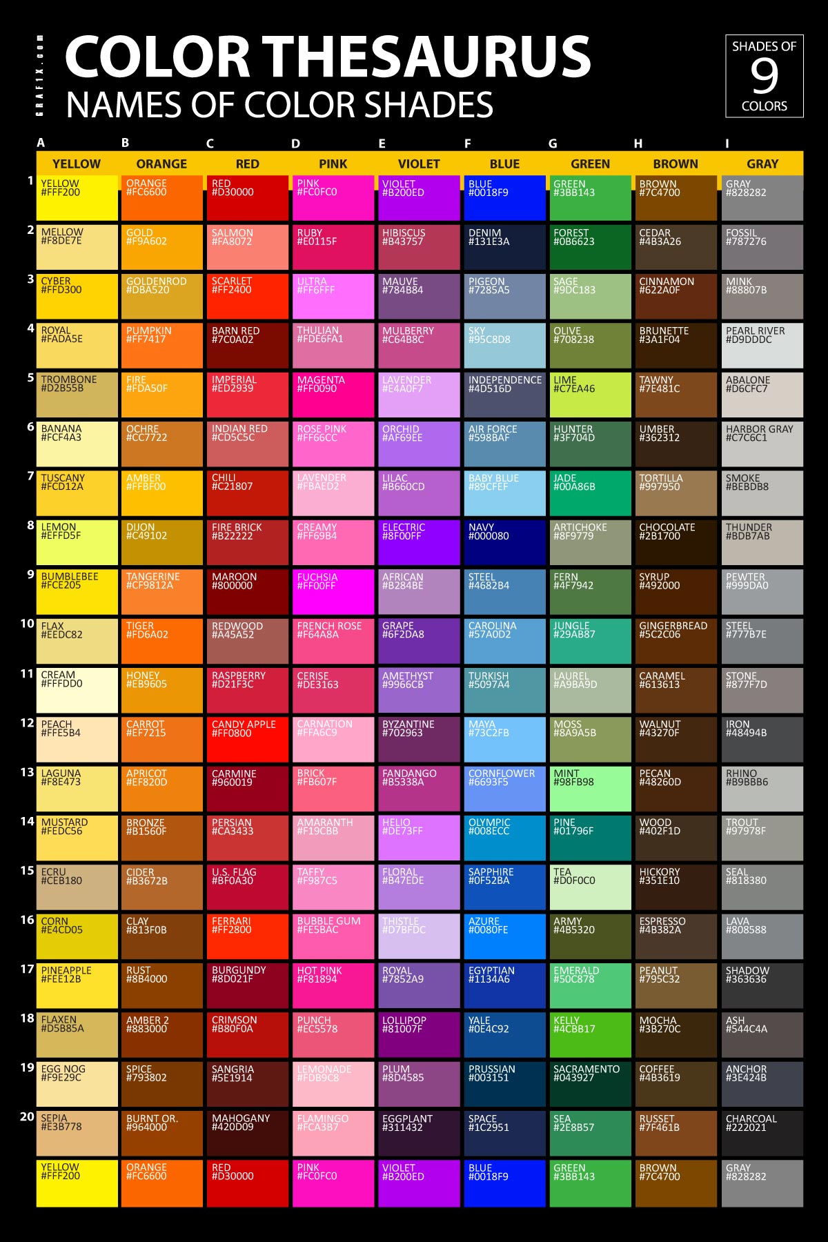
Start by doing a little research into the psychological impact of each color. Here, we’ll break down the impacts and associations of some of the most popular color choices.
Red
Did you know that the color red has been scientifically proven to raise blood pressure levels?
It has also been shown to boost your metabolism, make you breathe faster, and increase your heart rate.
Sure, this might be perfect for a workout/sports website or a blog collecting donations for emergency situations. However, it’s less than ideal for businesses advertising spa services or mattresses.
Often, red symbolizes a sudden burst of energy and stands for power and authority. It can even intense passion and romantic feelings (think Valentine’s Day, especially.)
Red is commonly associated with the need to act quickly. It may even make your visitors think of warning signs or other potentially dangerous situations.
This means it could also work well for hospital, pharmaceutical, or even disaster-preparedness supplies.
Keep in mind too, that many people automatically associate the color red with sales. If you use it on internal product pages showing full-price merchandise, your visitors may end up feeling mislead.
That’s a great way to lose a customer’s trust.
Black
When used correctly, black is the height of professionalism, and can help you to take advantage of the current minimalism design trend.
However, using too black in your website’s background can make text hard to read.
To strike the right balance, make sure you’re using it to help images and your site design pop.
For example, to call a visitor’s attention to a specific drop-down menu item or product image, outline it in black.
Psychologically, the color black makes customers think of mystery, elegance, and class. However, it can also symbolize a period of grief and mourning.
So, if you decide to use black in your Divi website design, remember to keep the rest of your design clear. A black-and-white design is best.
Purple
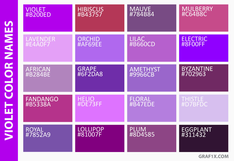
Purple is the color of royalty, which makes it an ideal fit for a luxurious lifestyle blog or online shop.
Most people commonly associate it with power, wealth, and high social status.
Especially when combined with yellows and golds, purple can be extremely effective in helping to communicate your brand’s influence to website visitors.
However, it’s also often associated with magic and creativity. This means it could make a wonderful part of a color scheme for those selling art, books, and hand-crafted items.
Orange
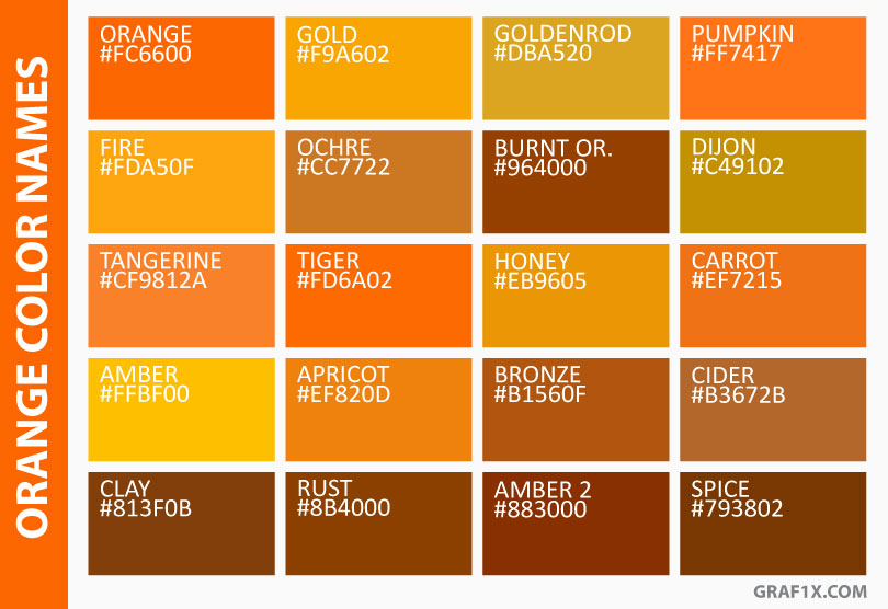
If you’re concerned that the boldness of red might be a little too much for your Divi website? Well then, opt for orange instead.
While it still gives off the same energy as reds, it’s not quite as aggressive.
It’s also a color often associated with warmer months and weather, meaning that it can make your visitors feel a sense of freedom.
If you’re a vacation or travel website, be sure to use a shade of orange in your design. This will help to encourage your visitors to expand their horizons.
Additionally, orange also instills feelings of happiness, enthusiasm, and possibility in your visitors. This means it’s a great fit for educational websites, whether for physical schools or online courses.
Yellow
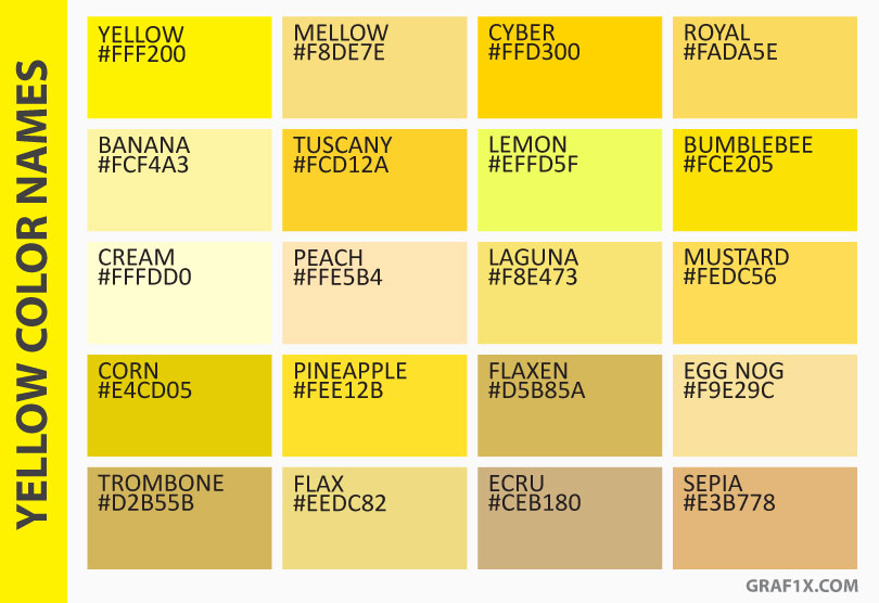
Yellow makes people think of the shining sun.
However, different shades of yellow can have drastically different impacts on your site visitors.
Yes, bright, neon yellows resonate with millennial markets and demand people’s attention.
However, softer shades of yellow conjure up natural images and often make people think of intellectual pursuits.
Yellow may even help to lower depression, which makes it a wonderful option for a site relating to self-help or therapy. It’s also associated with honor and remembrance.
This makes it a wonderful option for memorial websites or flower shops.
Yellow is also a commonly-used gender neutral color. So, if your Divi website’s content or any products you’re selling are marketable to folks of any gender?
Well then, yellow is certainly something you’ll want to use in your color scheme.
Green
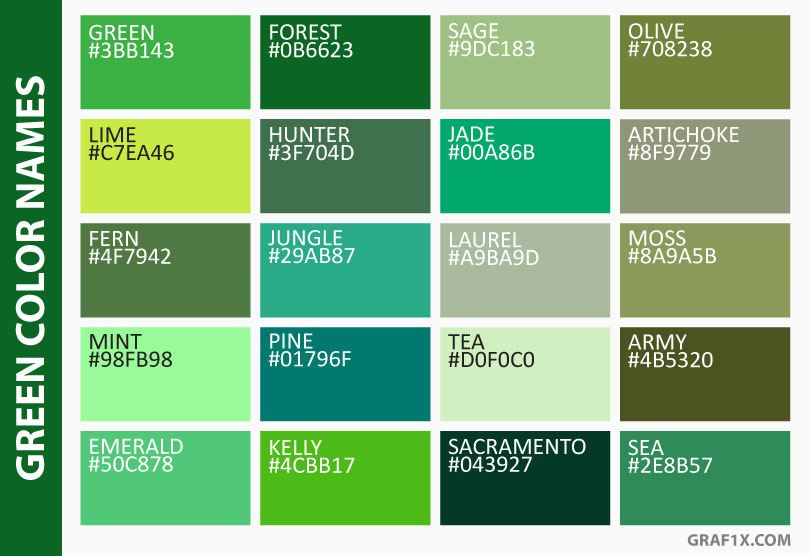
Of course, the first thing people think of when they see the color green is the natural environment.
While this helps people to relax and encourages them to detox from the tech-obsessed world around them, it’s also commonly associated with money.
In fact, green is one of the most versatile colors you can use in your color scheme. This could either be an asset or could muddle your branding.
Therefore, it’s important that you use with another complimentary color that drives home the message of your brand.
When used in a financial context, green makes people think of stability and potential prosperity. This means it’s a great choice for a Divi website advertising an investment firm or a bank.
Of course, its natural imagery makes green the ideal choice for natural lifestyle blogs, travel/outdoor websites, yoga studios, and much more.
Interestingly, green has been shown to have calming effects on both the mind and body.
While red speeds up your heart rate, green can help to slow it down. So, if you want your customers to feel at peace and safe as they browse through your site, be sure to use plenty of green.
Blue
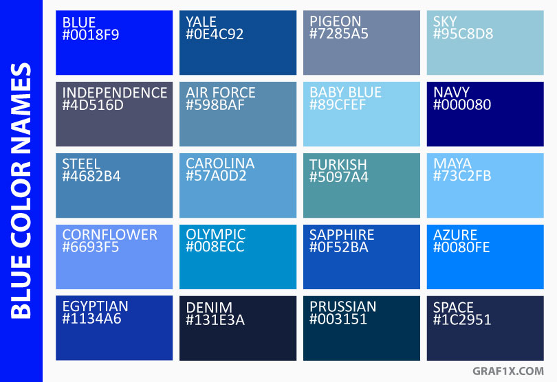
Blue is a bit similar to green in that it makes your Divi website visitors feel relaxed, reminds them of the outdoors, and often helps to establish a sense of trust between your brand and its customers.
However, in today’s digital age, it’s also a color that many will associate with popular social media platforms, like Twitter and Facebook. So, if your website has a large focus on social media, it could be a good idea to include this color in your overall scheme.
Additionally, blue is of course associated with rivers and seas, making it a wonderful choice for airline websites, canoeing or fishing businesses, and more.
As with some of the other colors mentioned here, the shade of blue you choose matters.
If you go with a lighter, more pastel blue, many people may associate your website with more child-like, light-hearted content.
But a darker blue can stand for strength, stability, and power. It is an excellent choice for already well-established businesses that want to communicate their authority to an online audience.
Use These Color Concepts In Your Divi Website
Thanks to this post, you’re now an expert in all things relating to color psychology.
No matter which colors you decide to use in your site design, it’s important that they help you to communicate the overall message of your brand. It’s also a way for you to psychologically sway your customers to feel a certain way, or to associate specific qualities with your brand.
However, finding the right color scheme is only a small part of your overall digital marketing strategy.
You’ll also need to consider keywords, your social media strategy, logo design, content marketing, and other logistics like loading speed and mobile-friendliness.
In other words, you’ve still got a long way to go.
Don’t be intimidated, and don’t let your lack of time and experience stand in the way of your Divi website’s success.
Instead, reach out to us to learn more about how we can help you to create a complete, dynamic digital marketing strategy that takes advantage of the latest developments and industry trends.
Make this the year your Divi website finally gains the following it deserves.
1 thought on “How to Choose a Color Scheme for Your Divi Website”
Hi!
Very Nice Tuto!
It could be realy cool to add to what each color of the Divi color palet fit…